Team GE Twitter Updates
Followers
About Me

Granado Espada Links
Blog Archive
-
▼
2008
(43)
-
▼
August
(8)
- The One About The Granado Espada-Razer ContestI wa...
- The One About GrabbermonV2.9 is just around the co...
- The One About Diego's Art NouveauI were looking th...
- The One About Weizhen's ArticleIt's definitely a s...
- The One About Granado Espada Gamer Girls in Playwo...
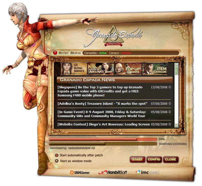
- The One About The New Launcher ScreenOne of my col...
- Edited 20 August 2008: Due to some scary bugs foun...
- The One About V2.6 Content Rollout ScheduleSo... w...
-
▼
August
(8)
Labels
- Calendar (3)
- Colony War (4)
- Community Events (11)
- Community Service (5)
- Factions (3)
- From IMC to You (2)
- Gameplay (7)
- Gamer Girls (5)
- GE Updates (9)
- Hellgate London (2)
- IAHGames (8)
- In-Game Events (3)
- Interviews (2)
- Premium Item Mall (5)
- PvP (1)
- Raid Bosses (2)
- Real Life Stuff (8)
- RNPCs (8)
- Team GE (10)
- V2.4 (5)
- V2.6 (3)
- V2.9 (5)
- v3.0 (7)
- V3.2 (2)
- v3.4 (9)
- V3.5 (1)
- V4.0 (1)


20 comments:
Just my 2 cents: Perhaps the character on the left could be replaced with an ele or something? I don't have anything against the female scout but according to several threads and polls in the forums, most players find the female scout least aesthetically pleasing.
Noooo! Female scout is my favorite, and she never gets any credit :P Just because she doesn't have the boobs and skanky dresses, people don't like her. Also she is the only character with short hair so it makes her super cute and unique.
As for the actual loading screen I think it's beautiful, and it fits the feel of GE a lot better than the current loading screen which is a little bland.
Yarrr! Female scouts need MOAR love! Anyway I think the reason why the creative team chose the female scout was because it was the least used character, as compared to their other collaterals. So they wanted to give the launcher a more 'fresh' feeling.
Relax, I don't have anything against the female scout, in fact I use one too. When I made that suggestion I was thinking of [mass appeal].
Another suggestion here: How about set up a poll to let players decide which character they want to have featured on the loading screen?
why not all of them? make a random character appear everytime the launcher is opened.
like Lineage2's launcher...
Re: staark
Hmmm good idea, maybe next time round. :)
Re: the arc
That would be nice, I'm not sure what the back end technical requirements are like though. I'll bring up the suggestion to the Creative dept and hopefully it is technically compatible with the current system. :D
Hmmm, perhaps you guys could include the non-playable characters as well eg market manager?
On a sidenote, can we include Hrin as one of the characters for the loading screen too :P?
nuUu~ ppl wont want to launch the game if hrin is in the loading screen!!
*evil laugh*
im joking ^^
The GUI is very well done but it would be nicer if it has a slightly darker tone to it.Make it almost a "wood" feel cos i believe the launcher is in a shape of a 17th century paper scroll of some sort? .
that scout on the left wearing Le Noir complements the colours. larve it.
Scout in a Elite bikini PL0X!!!
Scout in a Elite Bikini PL0X!!!
The launcher screen is awesome. I would say a fresh look for a fresh start.
I suggest to have the other stock characters of GE on the left aside from just scout. Add the fade effect just like the background for the current launcher so that the characters change from time to time and it'll be great.
Also, have the stock characters equipped with le noir armor since we are introducing le noir in version 2.6.
Jiejie ! Its Great ! Yay For It ! =d
When will this launcher come in sGE? and will be this a launcher also in SotNW?
I like it ^^
ARGH!!! why beijing.. so far before this beijing.. there is a lot olimpic before... there should be mini skirt costume -^_^-
I like it. As long as you stick w/ art of the females(not counting that really old shemale)you have my seal of approval :D
It might be a good idea to have some kind of option in the launcher to chose what character appears.
It looks good <3
this is a very nice concept! one that breaks away from the painfully repeating rectangular box of the loading screen. in my honest opinion, this picture of the scout is well-chosen; her pose resembles that of one leaping into action, just before going in-game too!
the buttons will do fine if someone forgets to top-up on g-points and is unwilling to launch the web browser. plus i just love those borders. *hearts*
i will be elated if this was put to use! ^^
This one's a total Yay for me :D It really sticks to the classy theme yet the Femme scout reminds yo that there's a lot more action in the game itself :D This mey grab other none players' attention and might consider trying the game out :D
I think it looks fantastic!!! SO lovely.
Post a Comment